
Exploring the Flexibility of Dynamic Typographic Grids: How Adaptive Layouts Transform Reading Experiences
When you think about how you read on different devices—say, switching from a phone to a desktop—you might notice how your reading experience shifts. On a tiny screen, text can feel cramped or overly squished, while on a large monitor, the same text might stretch out so much that your eyes jump between distant lines. That’s where dynamic typographic grids come into play. They’re like the chameleon of web design—changing, adjusting, and evolving to fit your device, your zoom level, or your scrolling habits, all to make reading smoother and more comfortable.
Traditionally, websites and digital documents used fixed grids—think of these as invisible scaffolding or grids that layout the content rigidly, regardless of screen size. These systems are simple but not always ideal for today’s multitasking world, where users switch among all sorts of devices. Dynamic grids, on the other hand, leverage responsive design principles combined with smart algorithms to tailor content on-the-fly. They adjust line lengths, font sizes, spacing, and even the flow of text as you move, scroll, or resize the window.
Imagine scrolling through an online article on your tablet. As you switch from portrait to landscape mode, the paragraph widths might tighten or loosen, ensuring that lines are neither too long (which makes reading harder) nor too short (which interrupts the flow). Or consider eBooks that adapt text density based on your vision preferences, eye comfort, or lighting conditions. These flexible systems aren’t just about aesthetics—they’re about making the reading experience more human-centric.
The benefits are clear. Adaptive layouts can reduce eye strain, prevent fatigue, and keep you engaged longer because the text feels natural and well-proportioned no matter what screen you’re on. They can highlight key points through visual hierarchy, subtly guiding your eyes through the content, and making navigation feel intuitive. Plus, visually harmonious layouts can elevate the overall aesthetic, making content not just readable but also enjoyable.
But it’s not all smooth sailing. The challenge lies in designing these grids so they’re not just reactive, but also predictable and easy to follow. When the adaptivity is too aggressive or algorithms aren’t fine-tuned, layouts can become chaotic—sections might break up unpredictably or merge in confusing ways. Imagine reading an article where a paragraph suddenly splits in strange places or jumps around unexpectedly—that can frustrate rather than facilitate understanding.
Designers need to build these systems carefully, striking a balance between flexibility and clarity. Accessibility is also a big consideration. For users with visual impairments or reading difficulties, overly aggressive adjustments might make the layout harder to interpret or even cause confusion. Therefore, the goal is to craft responsive grids that adapt smoothly, maintaining visual hierarchy, consistent spacing, and legible fonts across all devices.
In essence, dynamic typographic grids are reshaping digital reading by making content more responsive and human-centric. They’re not a magic fix but a tool—one that, when used thoughtfully, can elevate user experience by delivering content that feels tailored, comfortable, and engaging no matter where or how you read.
More EV News

How Adaptivity Improves or Hindrances Readability: The Science Behind Responsive Text Layouts and Their Impact on Engagement
Now, let’s dig into why these adaptive grids matter—especially for readability. The core idea behind responsiveness is simple: make sure that whether you’re reading from a smartphone, a laptop, or a giant monitor, the text remains easy on the eyes and easy to understand. But achieving that isn’t just about resizing fonts or tweaking line lengths; it’s about understanding how our brains and eyes interact with text in different contexts.
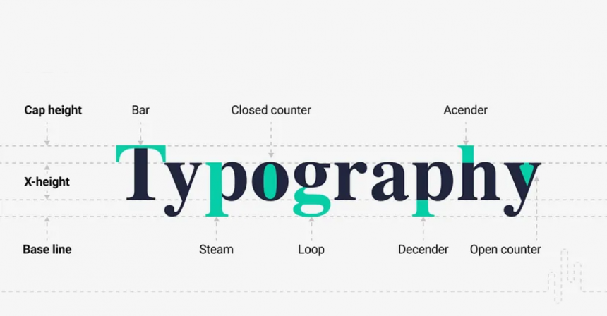
Research from cognitive science and user experience studies has repeatedly shown that certain text characteristics—like line length, font size, spacing, and contrast—are crucial for maintaining readability. For example, studies suggest that optimal line length is usually around 50–75 characters; beyond that, readers tend to lose focus or find it harder to track back to the beginning of the next line. Too short, and reading becomes choppy or disjointed; too long, and it strains the eyes. Responsive layouts aim to keep line length within that sweet spot across devices, automatically adjusting as the viewport changes.
Similarly, font size needs to adapt based on screen size so the text is legible without zooming or straining the eyes. Line spacing (leading) influences how easily the eye can move from one line to the next. If lines are too close together, it’s harder to scan quickly; if they’re too apart, it can feel like reading disjointed snippets. Proper adaptivity ensures spacing scales appropriately, maintaining a smooth, flowing reading rhythm.
But adaptive design isn’t just about simplicity; it’s also about fostering engagement. When text adapts well, it feels natural. Readers aren’t distracted by awkward gaps, inconsistent font sizes, or overflowing blocks of text that seem to ignore the device context. Instead, they can browse through content comfortably, at their own pace, because the layout responds to their needs in real-time.
However, the flip side is that poor implementation or over-optimization can backfire. Imagine a layout that adjusts font sizes too drastically or line lengths that swing wildly from one extreme to another as you resize your window—this inconsistency can be jarring. In some cases, dynamic grids might fragment a paragraph into disjointed segments, breaking the flow of reading and making comprehension more difficult. For instance, if headings or crucial content are resized differently without symmetry, it can disrupt the visual hierarchy, confusing the reader about what to focus on.
Another challenge is accessibility. Responsive grids often focus on visual adjustments, but they need to be inclusive. For people with dyslexia or visual impairments, certain adjustments like excessive scaling or unpredictable layout shifts can hinder understanding rather than help. Designers must consider contrast, readability, and predictable behavior alongside responsiveness to create truly inclusive content.
In practice, several case studies demonstrate both successes and pitfalls. For example, some news websites use adaptive grids effectively—text adjusts seamlessly between devices, maintaining visual harmony and readability. Others have implemented responsiveness in ways that result in inconsistent line spacings or confusing breakpoints, frustrating users and decreasing engagement.
The key takeaway? While adaptive text layouts can significantly boost readability and user engagement, only if the design balances responsiveness with stability and accessibility. Content creators should rely on evidence-based guidelines—like optimal line lengths, appropriate font sizes, and considerate spacing—and test across multiple devices and user groups. Keeping an eye on real-world user behaviors and preferences helps refine these systems, ensuring that adaptivity enhances, rather than hampers, the core goal: making content clear, comfortable, and compelling to read.
In conclusion, embracing dynamic typographic grids isn’t just about keeping up with tech trends—it’s about fundamentally understanding how humans read and interact with content in various contexts. When designed thoughtfully, adaptivity can turn a static, rigid layout into a flexible, intuitive, and engaging experience that meets the nuanced needs of diverse readers. But as with all powerful tools, it demands careful balancing—honoring both the science of readability and the art of design—to truly elevate the way we experience digital content.


