Over the past few years, UI design has been anything but static. It’s been a whirlwind of innovative trends, bold experiments, and thoughtful shifts—all aimed at making our digital experiences more engaging, accessible, and intuitive. If you’ve noticed that apps or websites look a little different lately, or if you’ve wondered why some interfaces just “feel right,” you’re not imagining it. The design landscape is constantly evolving, influenced by technological advances, changing user expectations, and a lot of creative experimentation. Let’s take a deep dive into how these new approaches have come about, what’s driving them, and see some concrete examples that showcase the coolest stuff happening right now.
How UI Design Approaches Have Changed in the Last Few Years: A Deep Dive into Trends and Transformations
In just a few short years, the way designers approach user interfaces has shifted profoundly. Here are some of the major trends and underlying reasons behind them:
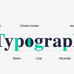
1. Minimalism and Focus on Content
The trend toward minimalism isn’t new, but it’s become even more pronounced recently. Fewer cluttered elements, more breathing space, and a focus on core content help users concentrate without distraction. Think of apps like Apple Music, which favors clean typography and ample white space, making it easier to discover music without visual noise.
2. Dark Mode and User Comfort
Dark mode has exploded in popularity—mainly because it’s easier on the eyes and conserves device battery life. Major OS updates (like iOS 13 or Android 10) made dark mode a built-in feature, encouraging designers to integrate it seamlessly into their apps. Not only does this improve comfort, but it also provides a sleek, modern aesthetic that many users find appealing.
3. Neumorphism (Soft UI)
Neumorphism is an aesthetic that blends skeuomorphism and flat design, creating soft, extruded-looking interfaces that look almost tactile. Think of buttons that seem to “push in” or “pop out,” giving a subtle, realistic depth. This approach adds a playful yet sophisticated touch to UI design—seen in some banking apps or dashboard tools aiming for a modern yet approachable look.
4. Personalization & Custom Experiences
Today’s users expect interfaces that feel like they’re built just for them. Dynamic content, personalized recommendations, and adaptive layouts are increasingly common. Netflix’s personalized homepage or Spotify’s playlist suggestions are good examples of how UI adapts based on user behavior, making interactions more relevant and engaging.
5. Micro-Interactions & Motion Design
Micro-interactions are small, often delightful animations or responses that happen when you engage with a UI—like a heart filling up when you like a photo or a button bouncing when tapped. Over the past three years, these tiny touches have become vital because they add emotional connection and make interfaces feel alive. Apple’s iOS and Android have embedded such micro-interactions into their systems, elevating overall user engagement.
More EV News

6. Accessibility and Inclusive Design
In recent times, the focus on making digital experiences accessible to everyone has gained momentum. Designers now prioritize high-contrast color schemes, easy-to-read typography, and assistive technology compatibility. Google’s Material Design guidelines and Apple’s Human Interface Guidelines are leading the way in promoting inclusivity as a standard, ensuring that products work well for people with disabilities.
7. The Rise of Voice & Gesture Interfaces
Voice assistants (like Alexa or Siri) and gesture-based controls have reshaped UI thinking. No longer are interfaces confined to screens—voice commands and touchless gestures are becoming part of the core experience, especially in smart environments or wearables. Designing for these new modalities involves creating intuitive flows that recognize natural language and movements.
Real-World Examples and Insights: How Modern UI Design Is Shaping User Experiences Today
Now, let’s look at some actual examples that highlight these trends in action, and understand what makes them work so well:
Example 1: Spotify’s Visual & Personalization Push
Spotify has nailed the combination of personalization and dynamic UI. The app uses bold album art, customizable playlists, and micro-animations that give feedback when users interact. The Personalized “Wrapped” feature at the end of each year is a standout—an interactive, visually rich experience that makes users feel connected to their music habits. This approach keeps users engaged beyond simply listening, encouraging sharing and social interaction.
Example 2: Apple’s Dark Mode & Flat Design
Apple’s consistent use of dark mode across iOS and macOS devices exemplifies user-centric design. Their minimal, flat aesthetics with subtle shadows create an elegant, distraction-free interface. Features like the new Control Center float nicely over the dark backgrounds, providing quick access without overwhelming visual clutter. It’s a big shift toward user comfort and sleek simplicity.
Example 3: A Banking App Using Neumorphism and Micro-Interactions
Some newer fintech apps like N26 or Revolut have adopted neumorphic buttons and subtle elevation effects, making interfaces feel softer and more inviting. When you tap to toggle options or submit transactions, small micro-interactions—like smooth animations or color changes—make the experience satisfying and easy to navigate, reducing anxiety around financial data.
Example 4: Inclusive Design on Government or Public Service Sites
Many government sites now implement high-contrast modes, adjustable font sizes, and screen reader compatibility. This shift reflects the broader push toward inclusivity, ensuring that digital services are usable by everyone regardless of disability. Thinking ahead, designers are making these accessible features intuitive and integrated into the core design rather than optional add-ons.
Example 5: Gesture Control in Smart Home Apps
Apps like Google Home or Apple Home allow users to control devices via swipe, tap, or voice commands. Clear visual cues, such as animated icons that respond to gestures, make these control schemes intuitive. These interfaces are designed around natural movements, making interactions feel effortless and reducing friction in managing smart environments.
Wrapping Up: The Future of UI Design
What can we expect moving forward? Based on current trends, UI design will likely continue to emphasize personalization, accessibility, and natural interactions like voice or gesture control. We’ll see more adaptive interfaces that change based on context, smarter animations that are purposeful rather than decorative, and a bigger focus on emotional connection—making digital experiences not only functional but genuinely enjoyable.
Design isn’t just about how things look anymore—it’s about how they feel and how well they serve users’ needs. Over the last three years, this shift has been both rapid and exciting, pushing the boundaries of what interfaces can do and how we interact with technology. Whether you’re a designer, developer, or just a curious user, staying informed about these evolutions helps us appreciate the artistry and thoughtfulness behind modern UI design—and inspires us to think bigger about the experiences we can create in the future.
If you found this overview helpful or want to explore specific trends deeper, don’t hesitate to ask. The world of UI design is always moving forward, and there’s plenty more to discover!